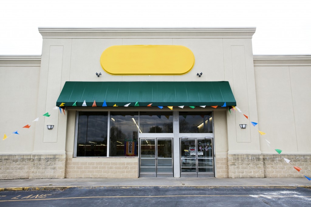
The first thing that customers see is the signage outside your store. Hence, it can make or break your business’s storefront appeal. If you want to create a storefront that will attract customers to your business, here are the common mistakes to avoid:
1. Wrong size
When it comes to business signage, size matters. And if your storefront sign is too big, it can take the attention away from other essential elements of your exteriors. If it’s too small, it can easily be missed by people passing by.
Before designing your sign, get the appropriate measurements for your storefront to ensure your sign is neither too big nor too small.
2. Too much information
A sign that has too many elements to it, whether it be images or text, is more likely to drive away customers. Why? Because it looks too complicated, and humans naturally look away when their senses are bombarded.
Avoid this problem by keeping your sign simple. It should be straightforward and easy to understand. Similarly, avoid using too many colors, as this can also make your sign difficult to absorb.
3. Poor contrast
You want your sign to be seen from a reasonable distance. If its contrast is reduced, customers won’t be able to view it. Ensure that your signage letters will stand out adequately against the background. A laser wood-cutting machine can help you achieve this.
4. Bad font

The text on your storefront signage should be easily readable. If you use a font that is too fancy or illegible, it can be difficult for your customers to read, let alone understand. Stick to simple fonts instead. Moreover, if you are using more than one font, ensure that they complement instead of clash together.
5. Excessive logo design
A logo is essential for any business. It’s the face of the brand and the number one thing that most customers will remember about you. Hence, going with a poorly-designed logo is a recipe for disaster.
Invest in a high-quality graphic designer to create a well-designed logo that will reflect your brand accurately.
6. Improper spacing
Inaccurate measurement can lead to improper spacing, which can make your sign look wonky when it’s installed. The space between letters also differs when typing on the computer that can similarly make your sign look odd. To avoid this, type each separately (if you are designing it yourself) and place them together in such a way that the spacing seems natural.
When it comes to installation, it is wise to create a paper template first when putting up your letters. Doing this will help ensure that the spacing is right.
7. Too minimalist
Although simplicity is recommended for storefront signage, designing your sign to be too simple is also a mistake. Not only does this make your store look dull, but it also doesn’t make a lasting impression on customers who see it.
Your storefront sign, aside from your window displays, is what attracts customers to your store. When you think of it as the “face” of your business, you don’t want it to be unattractive or poorly-designed. Hence, when creating your business’ signage, steer clear from these common design mistakes.


